UI Overview
The following sections will cover the main areas and common elements of the NIM UI, providing an overview of the interface and how to navigate the system.
NIM Toolbar
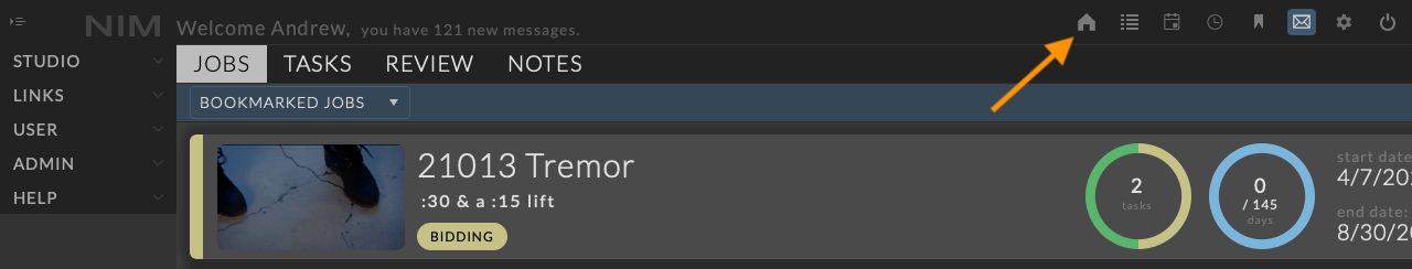
The NIM toolbar offers quick access to commonly used tools. The items displayed in the toolbar depend on the user’s permission group. Not all users will have access to every toolbar item.
Example:
If a user does not have permission to access the job list, the job list icon will not appear in the toolbar.
Toolbar Actions:
|
The home button returns the user to their dashboard. |
|
Opens the job list. This item is accessible by permission only. |
|
Opens the schedule. This item is accessible by permission only. |
|
Opens the user’s timecard entry window for quick access to timecard information at all times. |
|
Opens the user’s bookmarks list. Jobs can be bookmarked from the Job Overview page. Bookmarks can be deleted by clicking the X at the right of each entry. |
|
Opens the user’s list of notes on items they are assigned to, including assets, shots, tasks, and dailies. |
|
Opens the user’s preferences page. |
|
Logs the user out of NIM. |


NIM Menus
NIM menus are organized into two main sections: the main menu, and the job menu. The main menu is the default view when logging into NIM. The job menu is displayed when a job is selected.
Main Menu
The main menu includes sections related to global information and settings. These areas include:
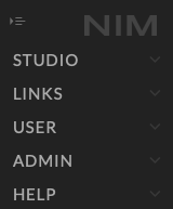
Studio:
Job List - A comprehensive list of all jobs managed within NIM, providing an overview of active and archived projects.
Timecards - Various views for creating, managing, and reviewing timecards, allowing for accurate tracking of work hours.
Calendars - Calendar views for events and deadlines that are not tied to specific jobs, offering a broader organizational overview.
Schedule - A global schedule that integrates all jobs, users, and resources, providing a unified view of the company’s operations.
Contacts - A centralized list of all contacts, including clients, vendors, and other stakeholders, used for jobs and bids.
Financials - Tools and views for managing financial data, including expenses, invoices, and other financial records.
Actuals - Views and tools for tracking actual costs and progress against estimates, helping to monitor project profitability.
Archives - A list of all archived created for jobs, files, and data, providing access to historical records.
Media - A global repository of all media assets, accessible across all jobs, ensuring easy retrieval and management.
Tasks - A Gantt chart view of tasks across all jobs, enabling efficient task management.
Links: This menu appears if custom links have been created in the Admin > Links section. These links will load directly within NIM if possible. Otherwise, there is an option to load the link in a new browser tab. Custom links can have security groups applied to them, so they are only available to users within the associated security group.
User: This menu offers tools for individual users to add and review their timecards, approve submitted timecards, and customize their personal settings.
Timecards - A list of all timecards created by the user, allowing for easy review and editing.
Approvals - A list of all timecards submitted by other users for approval, enabling the user to review and approve or reject them.
Preferences - A page for customizing the user’s details, timezone, and other settings.
Admin: This menu provides access to all the pages necessary to customize NIM to meet the needs of your facility. For more information on the Admin section, see the Admin section of the documentation.
Job Menu
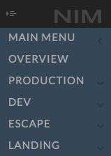
When selecting a job, the main menu slides to the left, and the job menu is loaded. To return to the main menu, click the < Main Menu button at the top of the list. A Job Menu > button will then appear at the top of the main menu, allowing you to return to the currently loaded job.
Job Menu Sections:
Job Overview - The job overview loads the job dashboard with access to the following sections:
Job Details - Basic information about the job, including job name, type, and status.
Job Notes - A place to store notes and other information related to the job.
Job Review - A list of all review items related to the job.
Production - Production tools related directly to the job, including:
Job Configuration - Job settings, including job type, status, and other details.
Crew Assignment - Management and assignment of crew members to the job.
Job Calendars - Calendars specific to the job.
Job Media - Media specific to the job.
Bidding - Tools for creating and managing bids for the job.
Job Timecards - Tools for managing timecards related to the job.
Expenses - Tools for tracking expenses related to the job.
Actuals - Tools for tracking actual costs and progress against estimates for the job.
Invoices - Tools for tracking invoices for the job.
Job Development - This area tracks assets global to the job.
Assets - Multiple views to work with assets and tasks created for the job.
Review - All asset based review items.
Tasks - A gantt chart view of asset related tasks for the job.
Job Shows - Shows can represent individual spots, deliverables, or sequences of shots. In this example, there are two shows: “Drive” and “Engine.”
Sequence - Multiple views to work with shots and tasks created for the show.
Previs - Optional location for previsualization data or to be used as a workspace prior to creating shots.
Review - All review items for the show.
Tasks - A gantt chart view of shot related tasks for the show.
Hiding the Menu
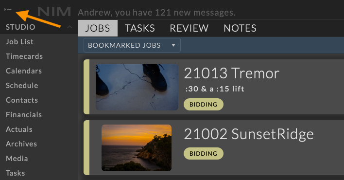
The menu button in the upper left corner will hide and unhide the menu.
This provides more screen space for the main content area. Click the button again to show the menu.
Working with Grids
Grids are a fundamental component in NIM, and mastering their workflow will significantly improve your efficiency.
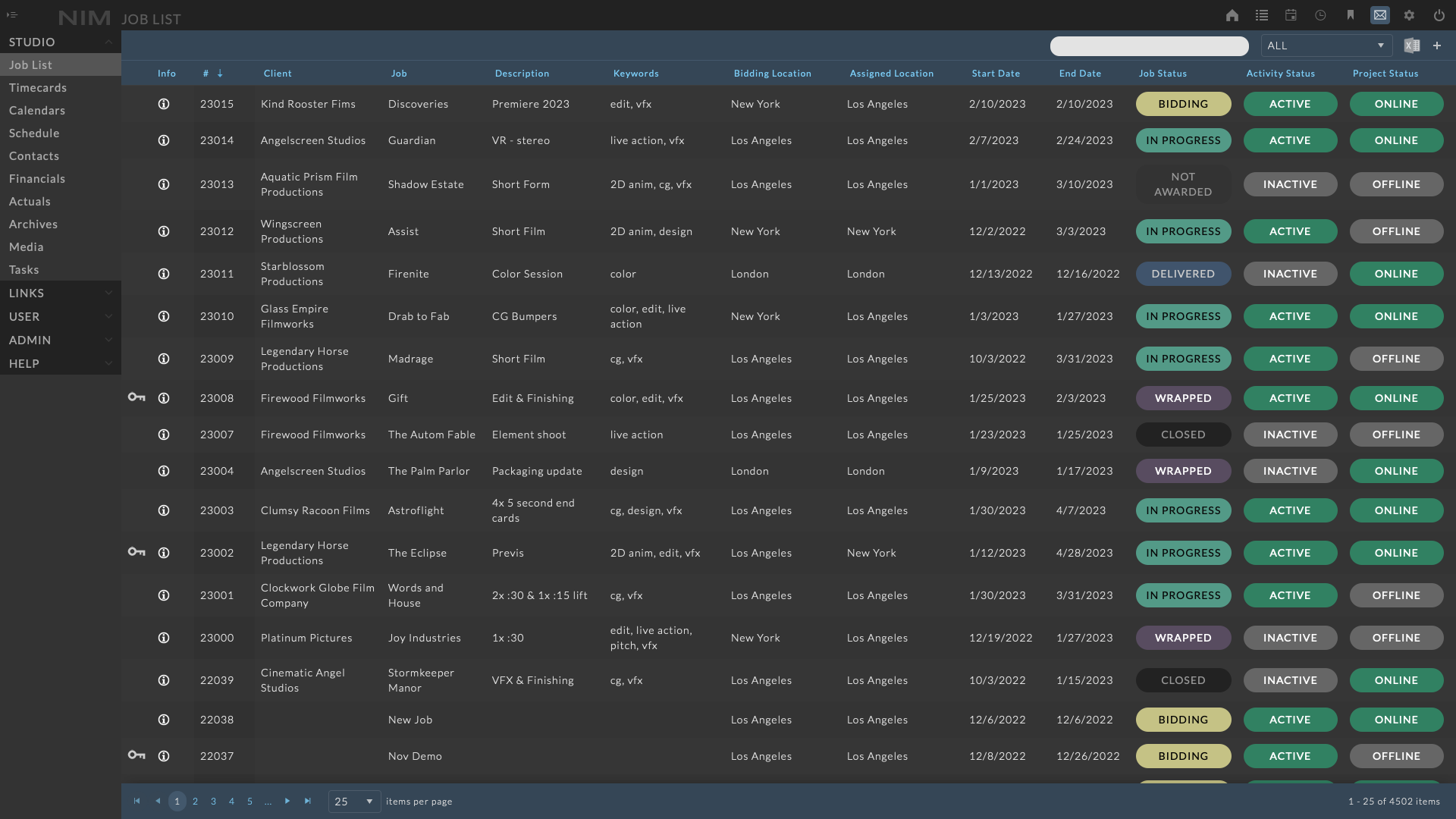
Grids can be sorted, filtered, and customized to suit your needs. Grids that display the  button can be exported to Excel, with all applied filters, sorting, and ordering preserved in the exported document
Column Sorting

To sort a grid, click on the header of the column you wish to sort by.
An arrow indicating the direction of sorting will appear next to the header label.
Click the header again to reverse the sorting order.
Click the header a third time to return to the default sorting state.
Column Reordering
The columns of a grid can be ordered to present the information as you see fit. To reorder the columns in a grid, click on a column header and drag it to the new desired location. Drop the column header over its new position to set its location.
Hiding Columns
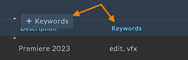
Columns in a grid can be hidden to customize the grid view.
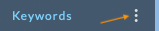
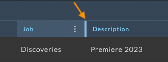
To hide a column, click on the ellipsis menu that appears at the right of any column while hovering over the column header.
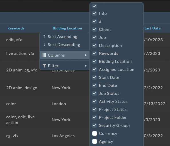
An expanded list will display all the column names within the grid. Columns in the grid that are checked will be visible.
Click on the checkbox next to the column name to deselect the item and hide it from the grid.
Reselect the checkbox to display the column again.
Resizing Columns
Hovering over a column header will highlight the drag handle.
Click, hold, and drag to resize the column.
Filtering
Grids may offer different filtering options depending on the view. Some grids feature a filter panel at the top, providing advanced filtering capabilities, while others use column filters, which are ideal for quickly obtaining basic results.
Column Filters
To filter a grid using column filters, click on the ellipsis menu that appears at the right while hovering over the header of the desired column.
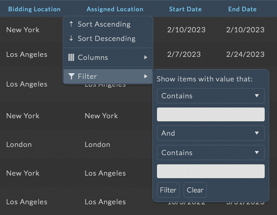
A dropdown menu will appear with four options:
Sort Ascending
Sort Descending
Columns
Filter
Hover over the Filter option, and the Filter Menu will expand.
Choose the desired filter type and enter the filter information in the text input field.
Multiple filters can be applied to a single column by choosing the AND or OR option from the dropdown.
Click Filter to see the results.
To clear the filter, reopen the filter menu for the column that was filtered and click the Clear button.
The Reset Filters button at the top of the grid can also be used to clear all columns filters applied to the grid at once.
Note
The filter criteria will vary depending on the data type of the column.
Filter Condition |
Text |
Date |
Number |
|---|---|---|---|
Is equal to |
x |
x |
x |
Is not equal to |
x |
x |
x |
Starts with |
x |
||
Contains |
x |
||
Does not contain |
x |
||
Ends with |
x |
||
Is before or equal to |
x |
||
Is after or equal to |
x |
||
Is before |
x |
||
Is after |
x |
||
Is less than or equal to |
x |
||
Is greater than or equal to |
x |
||
Is less than |
x |
||
Is greater than |
x |
||
Is null |
x |
x |
Filter Panel

The filter panel users to efficiently filter items in the view based on specific criteria.
The panel provides a point-and-click interface for creating complex filter rules, making it easier to manage and navigate through large amounts of data in the schedule.
Filter Panel Overview
Context Specific Filters

Some filter panels contain context specific filters that are tailored to the type of data being displayed.
In this example from the schedule view, the events filter options allow users to filter events based on job, location, and status.
This helps in narrowing down filter results with quick reference to item specific data, making it easier to focus on relevant activities.
Item Filters

The filter options available in the item filter will vary depending on the view it is being applied to.
Users can apply filters tailored to the specific data they are working with, ensuring more accurate and efficient results.
Quick Filters

In some filter contexts, a Quick Filter is available. The Quick Filter dropdown provides a set of predefined options that allow you to quickly narrow down the list of items based on specific criteria.
These options are designed to help you focus on relevant data without the need to manually create complex filter rules.
Using the Quick Filter:
Selecting a Quick Filter: Simply click the dropdown and choose the desired filter option.
Combining with Other Filters: The Quick Filter can be used in conjunction with other filters (such as custom filter rules) to further refine the filter results.
Creating and Editing Filters

Filters are created using a point-and-click tool that allows users to add and customize filter rules one by one.
Users can combine multiple conditions using “And” or “Or” logic, providing the flexibility to build complex filter expressions.
Filter Options
When creating filter rules, you can choose from several options to specify how the filter should be applied. The filter criteria will vary depending on the data type of the column.
Filter Condition |
Text |
Date |
Number |
|---|---|---|---|
Is equal to |
x |
x |
x |
Is not equal to |
x |
x |
x |
Starts with |
x |
||
Contains |
x |
||
Does not contain |
x |
||
Ends with |
x |
||
Is before or equal to |
x |
||
Is after or equal to |
x |
||
Is before |
x |
||
Is after |
x |
||
Is less than or equal to |
x |
||
Is greater than or equal to |
x |
||
Is less than |
x |
||
Is greater than |
x |
||
Is null |
x |
x |
Note
Is equal to: If the filter is being applied to a list of items, this option will provide a dropdown list to choose from.
Is not equal to: If the filter is being applied to a list of items, this option will also provide a dropdown list to choose from.
Filter Expression Preview:

As users create or edit filters, the filter panel displays a preview of the resulting filter expression at the bottom. This preview helps users understand the structure and logic of the filter, ensuring that the correct conditions are applied.
Using the Filter Panel
Accessing the Filter Panel

Open the filter panel by clicking on the “Filters” button in the toolbar. The panel will slide out, revealing the available filter options.
Configuring Context Filters

If the filter panel includes context specific filter options, use the dropdown menus in the top of the panel to select context specific filter items.
Configuring Item Filters

Customize the filter conditions to narrow down the list of items displayed, utilizing the various filter options to refine your search.
Applying Filters

After configuring your filters, click the “Filter” button to apply the filter settings to the view. The view will update to display only the items that match the filter criteria.
As this is an unsaved filter, the filter dropdown will display “Custom” to indicate that the current filter is a custom filter that has not been saved.
Clearing Filters

To clear the filter in the filter panel and return to the default view, click the “Clear” button. This action will remove all filter conditions and display the full list of items in the schedule.
To clear any filters applied from the filter dropdown, choose “All Items” from the filter dropdown. If an unsaved filter has been applied and the filter dropdown says “Custom”, open the filter panel and, click the “Clear” button.
Saving Filters

After configuring your filters, click the “Save” button to store the filter settings for future use.
A dialog will appear where you can enter a name for the filter and save it. The saved filter will be added to the filter dropdown menu for easy access.
Sharing Filters

To share the filter, navigate to the “Share” tab, select the users or user groups you want to share the filter with, and click “Save.”
The shared filter will be accessible to the selected users or user groups from the filter dropdown menu for the context that the filter was created in.
For example:
If a filter is created in the schedule view and shared with a user/user group, the filter will be accessible to all users in that group when viewing the schedule.
If a filter is created in the job list view and shared with a user/user group, the filter will be accessible to all users in that group when viewing the job list.
To change the sharing settings for a filter, select the filter from the dropdown menu, click the “Share” tab, make the desired changes, and click “Save” to update the sharing settings.
Loading Saved Filters

To load a saved filter, click on the filter dropdown menu at the top right of the view and select the desired filter from the list. The view will update to display only the items that match the saved filter criteria. The filter panel will also update to show the saved filter’s conditions.
Managing Saved Filters

To edit or delete a saved filter, select the filter from the dropdown, make the desired changes in the filter panel, and click “Save” to update the filter or “Delete” to remove it.
When you update an existing filter, you have the option to rename it at save to create a new filter with the updated settings. Alternatively, you can choose to overwrite the existing filter with the new settings by saving it with the same name.
The filter tool enables users to efficiently manage large volumes of information, ensuring they can quickly access the most relevant items without getting overwhelmed. By creating, saving, and sharing filters, users can streamline their workflow and quickly access the information that matters most.
Filter Examples
The following examples demonstrate how to build complex filters using the filter panel. These examples are designed to help you understand how to create filters that meet your specific needs and provide a more focused view of your information. The examples cover a range of scenarios and may not be reflective of the filter items available in you specific filter context.
Example 1: Filtering Users by Group and Employment Status
Scenario:
You want to filter the schedule to display only the users who are full-time staff, belong to the “Animators” group, and have the keyword “Remote” in their profile.
Filter Setup:

Filter Expression:
(
  Employment is equal to 'Staff'
  AND
  Keyword is equal to 'Remote'
  AND
  User Group is equal to 'Animators'
)
Explanation:
This filter will show users who are part of the Animators group and are full-time staff with the keyword “Remote” associated with them. This is useful when you want to see which staff animators are available and can work remotely.
Example 2: Filtering Users by Multiple Job Roles
Scenario:
You need to display all users who are either animators or compositors, and who are also available for overtime work.
Filter Setup:

Filter Expression:
(
  (
    User Group is equal to 'Animators'
    OR
    User Group is equal to 'Comp'
  )
  AND Keyword contains 'Overtime'
)
Explanation:
This filter shows all animators and compositors who are also available for overtime. The OR group ensures that both roles are included, while the AND condition further narrows down the list to those available for overtime work.
Example 3: Filtering Users by Employment Status and Excluding Specific User Groups
Scenario:
You want to view all freelance users except those in the “Comp” or “Animators” group.
Filter Setup:

Filter Expression:
(
  Employment is equal to 'Freelance'
  AND
  (
    User Group is not equal to 'Comp'
    AND
    User Group is not equal to 'Animators'
  )
)
Explanation:
This filter displays all freelance users, excluding those who belong to the Comp or Animators group. The AND logic ensures that both conditions are applied, effectively filtering out any Comp and Animator freelancers.
Example 4: Filtering for Multi-Role Freelancers with Specific Skills
Scenario: You need to find all freelance users who work in either the “Animators” or “Comp” departments and have the keyword “Senior” or “Lead.”
Filter Setup:

Filter Expression:
(
  (
    User Group is equal to 'Animators'
    OR User Group is equal to 'Comp'
  )
  AND Employment is equal to 'Freelance'
  AND
  (
    Keyword contains 'Senior'
    OR Keyword contains 'Lead'
  )
)
Explanation:
This filter narrows down freelance users who are either in the Animators or Comp groups and hold senior or lead positions, making it easier to identify experienced freelancers in these roles.
Example 5: Combining Complex Conditions for a Specific Team
Scenario:
You need to filter the schedule to show users who are either “Senior Animators” or “Lead Compositors,” excluding those who are currently assigned to the “R&D” department.
Filter Setup:

Filter Expression:
(
  (
    (
      User Group is equal to 'Animators'
      AND Keyword contains ‘Senior'
    )
    OR
    (
      User Group is equal to ‘Compositors'
      AND Keyword contains ‘Lead'
    )
  )
  AND User Group is not equal to 'R&D'
)
Explanation:
This filter is used to find senior animators and lead compositors while excluding any users currently in the R&D department. It ensures that only qualified users from the specific roles are displayed in the schedule, excluding those in R&D.
Search

The search field allows for users to quickly search through items for a matching value. Depending on the context, the search field may attempt to match the input on multiple fields. Only items whose fields match the search criteria will be displayed.
The search field is located at the top right of the view, next to the filter panel dropdown. The search will be applied to any current filters that are active. Simply type in the search field and press enter to filter the list of items displayed in the schedule. To clear the search, click the “X” button in the search field, or delete the search text and press enter.
Pagination
Grids are paginated to limit the amount of data retrieved in a single query.
At the bottom left of the grid, there are navigation buttons:

The first button navigates to the beginning of the list.
The back button steps back one page.
The numbered buttons navigate directly to the selected page.
The forward button steps forward one page.
The last button navigates to the end of the list.
At the bottom right of the grid, the current records out of the total records being displayed are shown, e.g., “1-50 of 2432 items.”
Info Panel
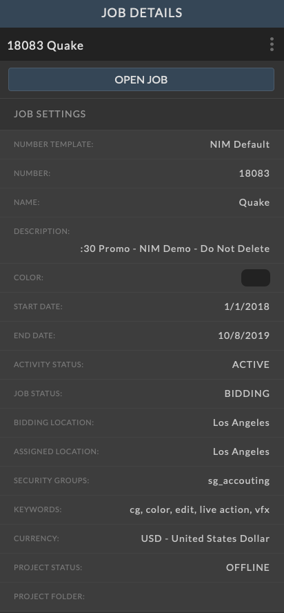
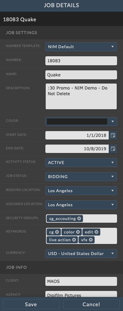
The info panel contains information related to a single entry and is the main location to edit data throughout NIM.
Info Panel Modes
The info panel has two modes for viewing and editing data. Access to these modes is dependent on the user’s permissions.
View Mode: By default, the info panel loads in view-only mode when accessing an existing item.
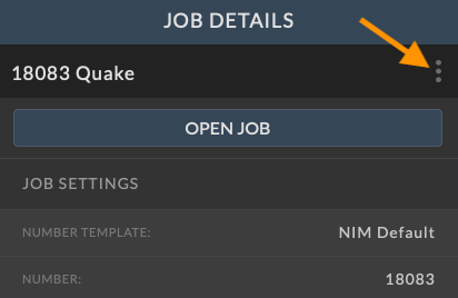
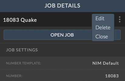
Edit Mode: To edit data, click the ellipsis button at the top right of the panel. This opens a popup menu with options, which may vary depending on the panel.
Common Options
The ellipsis menu in the info panel provides access to common options, such as editing, deleting, and closing the panel. The options available will vary depending on the view.
Edit - Switches the info panel to edit mode.
Delete - Deletes the item currently open in the info panel.
Close - Closes the info panel.
|
|
Working with the Info Panel
Editing an Item:
To edit an item in the info panel, click the ellipsis menu in the item’s info panel and select Edit.
After making the necessary changes, click the Save button at the bottom of the panel to apply your updates.
If you decide not to save your changes, click the Cancel button to return to view mode without saving.
Deleting an Item:
To delete an item, click the ellipsis menu in the info panel and choose Delete.
You will be prompted to confirm the deletion before it is finalized.
Closing the Info Panel:
To close the info panel, click the ellipsis menu and select Close. This will return you to the previous view.
Detail Views
Some info panels contain buttons that reveal detail panels, providing additional information about the item. These detail panels will slide out from the right side of the info panel, shifting the info panel to the left to maintain visibility.

To close the detail panel, click the ellipsis menu and select Close. This will return you to the previous view.